This article explains the different sections of the Visualize tab on the m-Path dashboard. The Visualize tab allows you to visually display data from one specific client. To go to the Visualize page from one specific client, go to the Clients tab and click on ‘‘ of the client whose data you want to visualize.
Response rate numbers
On top of the page you’ll find some numbers that’ll tell you more about the response rate of the participant.
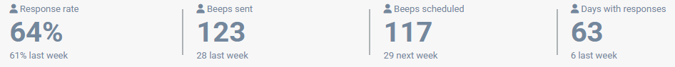
- Response rate: this is calculated based on completed scheduled beeps* divided by all scheduled beeps*
- Beeps sent: these is the total count of scheduled beeps* sent, whether they were completed by the participant or not
- Beeps scheduled: are all upcoming beeps* that are scheduled for the participant
- Days with responses: these are all days that the participant has responded to at least one beep* in the past.
*(scheduled) beeps don’t include: reminders, test on client notifications and self-initiated completing of questionnaires like button or repeat questionnaires.
“Last week” and “next week” talks about the 7 days following or previous days.
Example 1: “61% response rate last week“. Let’s assume today is a Wednesday, than it means that the participant completed 61% of the notifications they got from today until past Thursday.
Example 2: 1 beep is scheduled and 2 reminders are sent. On the second reminder, the participant fills in the questionnaire. The response rate will be 100%, because all the scheduled beeps were answered.
Example 3: 2 beeps are scheduled, the first one is missed. The second one is filled in and the participant initiates to repeat the questionnaire two more times. The response rate will be 50%, because only 1 of the 2 scheduled beeps were filled in and repeating a questionnaire is not included in the calculation of the response rate.
Select interactions
Under Select interactions, you can select the interactions you want to display on the Visualize page.

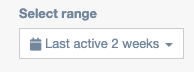
Select range
Under Select range, you can adjust the period of time you would like to display.
Settings
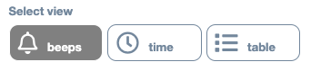
Select view
Under Select view, you can adjust the display of the data to beeps, time or table.
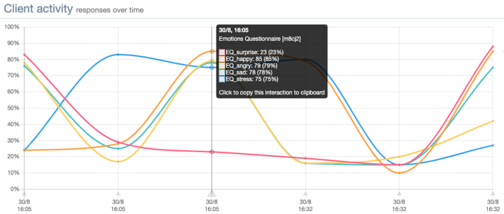
Beeps
If you select beeps, the client’s data will be displayed in a graph that looks like the one below. As you can see, the client’s data are grouped per beep and can be viewed in the small black windows.
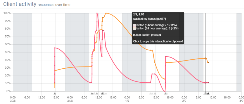
Time
If you select time, the client’s data will be displayed in a graph that looks like the ones below.
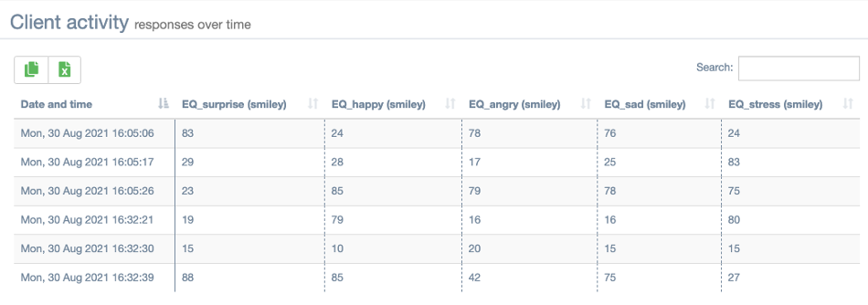
Table
If you select table, the client’s data will be displayed in a table that looks like the one below.
Selecting visualized variables
You can select which variables you want to visualize to achieve cleaner, more focused graphs and tables in this section:
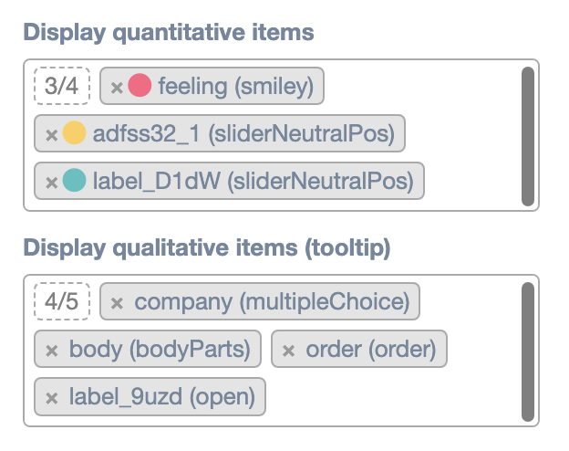
By default, all variables with submitted values will be displayed. You can hide quantitative or qualitative variables by clicking the “x” next to their respective label. To unhide variables, click any empty space inside the label selection box. This will display a list with all available labels, in which you can check all labels you want to visualize.
Display quantitative items
Under Display quantitative items, you can check the quantitative items (e.g. slider questions) you want to visualize. Note that you can only check items from the interactions that are checked in the Select interactions box.
Display qualitative items (tooltip)
Under Display qualitative items, you can check the qualitative items (e.g. open questions) you want to visualize. Note that you can only check items from the interactions that are checked in the Select interactions box.
Client activity
Under Client activity, the client’s data will be visualized. This visualization depends on the selected interactions, range, view, quantitative and qualitative items.
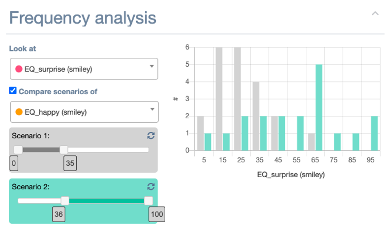
Frequency analysis
Under Frequency analysis, you can visualize the frequency of answer options for one item from the selected (quantitative) items.
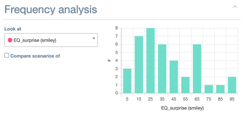
If you check the Compare scenarios of box, the following will appear:
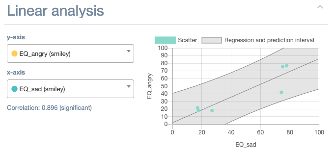
Linear analysis
Under Linear analysis, you can check the relation between two items from the selected (quantitative) items. The dashboard will display a scatter plot of the two selected items and will compute their correlation. Based on these, the graph will also contain a regression and prediction interval.
- Under y-axis, you can select the item you would like to display on the y-axis.
- Under x-axis, you can select the item you would like to display on the x-axis.
This looks as follows:
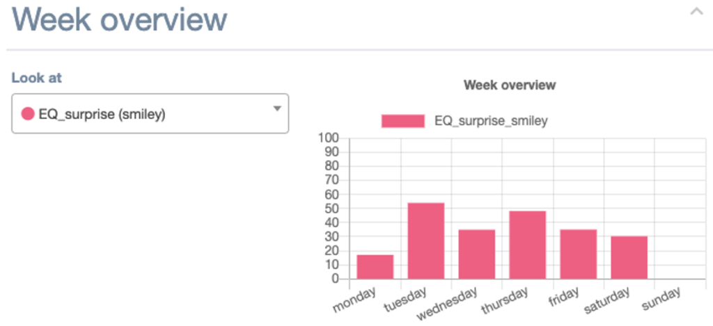
Week overview
Under Week overview, you can see the average of one (quantitative) item per day of the week. Note that you can only select an item from the selected (quantitative) items.
- Under Look at, you can select the item you want to display.
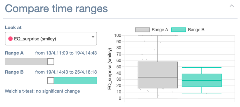
Compare time ranges
Under Compare time ranges, you can compare the client’s answers from two time ranges in terms of mean and variability by comparing the boxplots of these time ranges. Note that you can only select an item from the selected (quantitative) items.
- Under Look at, you can select the item you would like to display.
- Under Range A and Range B, you can select the two ranges of time you would like to compare.
The m-Path dashboard will automatically perform a Welch’s t-test to determine whether there is a significant change.
This looks as follows: