
If you want to compare some ordinal data groups, the barchart module allows you to do just that. In computations, you can generate some lists of data, which you can then visualise using this module.
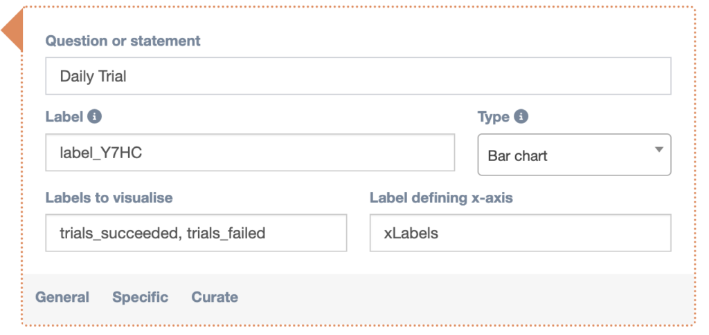
Labels to visualise
Here you can enter a comma-separated list of labels that you want to compare. These labels will most likely be the names of numeric lists you’ve assigned in a computation. These labels will be humanized in the app, so a label “this_label_counts” in the computation will be converted to “This label counts” when it gets visualised.
Label defining x-axis
In this optional field you can enter the name you’ve assigned to a list of strings generated in a computation. The strings in this list will be used as the tick labels on the x-axis of the bar chart.
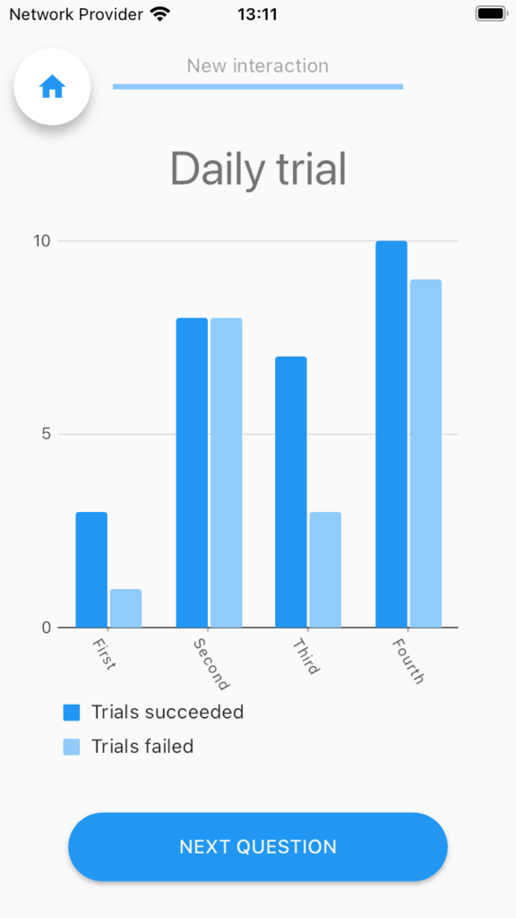
You can find a questionnaire in the library titled “TUTORIAL: Barchart Widget” which demonstrates the way this widget works, so you can experiment with it yourself.